Two information designers, Stefanie Posavec, an American living in London and Giorgia Lupi, an Italian living in New York built their long-distance friendship sending infographic postcards with hand-drawn visualisations of their weekly activities or thoughts to each other for 52 weeks. And “Dear Data” project -now also a book- was born.
Lupi and Posavec had only met twice before starting the project on September 1st 2014 and decided to describe to one another their weekly activities with an agreed-upon data theme: drinks they drank, animals they saw, desires they had, compliments they received or gave and so many other mundane activities we usually take granted, let alone collect the data out of them.
In the age of Big Data, the way Lupi and Posavec collected their daily activities might seem a little old fashioned, even romantic or waste of time for some reason and one might question why they didn't use apps to track their movements for the entire project. Well, they used once; there was only one exceptional week in which they used an app to do that. However the pair claims that using the app that week wasn’t as engaging as taking quick on-site jottings on paper or smartphone and it was more satisfying and rewarding for them to collect data that apps can not gather yet.
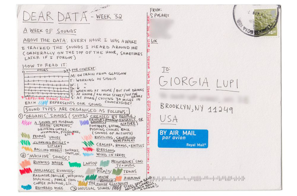
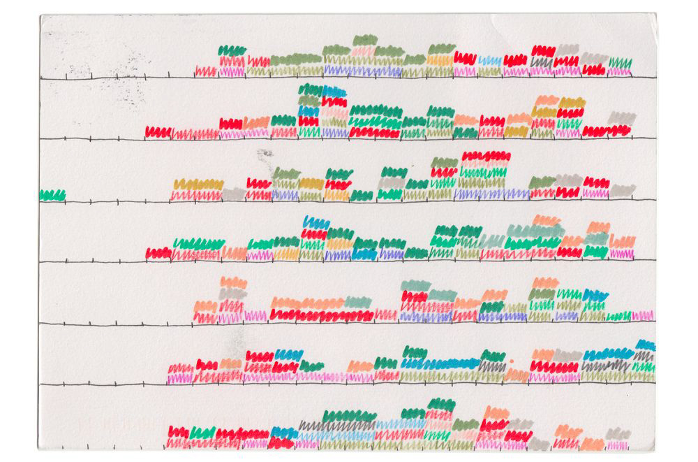
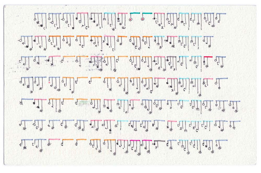
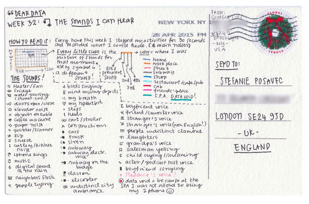
Besides the imperfect and humane side of the medium they used, the hours spent on making each card is also another thing about visualising data as a way of reflection of their life at that period and analysing their own habits. Not only the data itself but the way it is conveyed onto paper is also very personal and unique. Looking at the postcards, it is easy to notice Posavec’s and Lupi’s different styles and approaches. Lupi’s style in data visualisation is almost forensic: painstakingly drawn charts and detailed visualised devices. For the week 32, for example, she collected the data of each time she heard different sound and represented each of them by a note, colour-coding the parts that correspond each location she heard the sound and giving different lengths to those notes according to the prevalence of it. Posavec, on the contrary, chose a more intuitive and looser approach in her postcard -it only consists of colorful rectangles located on the specific time slot when she heard that sound.
As a result of this one-year long data sharing project, these 52 hand-drawn postcards were exchanged between Lupi and Posavec. They are all featured in the book named Dear Data -alongside their observations on their lives in data and some tips about becoming a data collector. This book, however, was not the only successful outcome of this unusual 52-week correspondence journey. The resulting project also won 2015 Information is Beautiful Awards, headed to MoMA’s permanent collection, exhibited at Somerset House’s Big Bang Data Exhibition and now is being exhibited at London Science Museum until July 2017.
Although it took MoMA’s acquisition team some time to decide whether or not to add Dear Data into the data visualisation collection which was started by Paolo Antonelli, the design curator of MoMA, these beautifully visualised postcards are now part of the collection just next to some prominent data visualisers like Martin Wattenberg, Ben Fry, Nicholas Felton and Fernanda Viegas, experimenting and exploring the edges of art-design-data visualisation disciplines.
2015, Eyeo Festival, Opening Keynote
http://www.dear-data.com/theproject/


